Select a text on the left to read it here.
Tanja Hoffman
2026 - read complete on The Ambrosia Journal
click to read in English
Tanja Hoffman: deliberations of colour as an entity and a mirror of the self
German artist Tanja Hoffman creates impossible places on her canvases through her experiments with colour; not “impossible” because they are unrealistic, but because they are built with the most intangible bricks: our consciousness.
These places are made of quasi-organic forms blooming from meticulous layering of vibrant colours. Hoffman insists upon the idea of “meditation” through her Zenpolychromos series, and conveys a fundamental aspect of human experience—the connection or lack thereof between what’s viewed and what’s seen—by inviting the observer to reflect on their own sensory experiences. By creating that which is physically contained yet somehow expands, the spaces Hoffman paints are boundless sources of deeper awareness of being in space and being-in-within. (...)
Q: Finally, the idea of “inner presence”, introspection, and meditation are very present in your work. I’m interested in hearing about your personal headspace while you’re working on a piece and how it influences the results. When looking at the Zenpolychromos as a series, there’s an incredible variation of colors and compositions; do you choose the colors, or do the colors choose you? How would you describe the way your art comes into being?
My state of mind while working is shaped by presence and openness. I try to step back from control and allow decisions to emerge from attentive engagement with the process itself. In this sense, working is less about executing a predefined outcome and more about entering a continuously shifting state.
The process can be described through the image of a river—one that you step into again and again. Even though the movement may feel familiar, it is never the same. Each work arises from new conditions, new experiences, and altered inner and outer circumstances. This openness to change fundamentally informs the way the work develops.
Within the Zenpolychromos series, this results in a wide range of colours and compositions. The colours are not determined in advance; they evolve through dialogue with previous layers, light conditions, drying phases, and perception. In this sense, I do not simply choose the colours—the colours emerge through the process. The series is less a closed system than an ongoing experience, in which each work represents a new moment within the same flow.
Tanja Hoffman’s invitations to soften the rhythm of life and ponder are irresistible, zen and Walden-like. Her infinite layerings, scraping, drying, and letting light in seem to work perfectly as an analogy to the composition and evolution of the unexplainable, immaterial presence we understand as the “I". Looking at a canvas, indeed, can be one of the most powerful ways to see ourselves.
Hiroshi Yoshida
2017
(...) One of the most fundamental aspects shin-hanga inherited from Western Art was the study of how light affects environments. Hiroshi Yoshida, like the French Impressionists, studied the effects of the time of day and the months of the year on the same landscape. Coloured woodblock printing presents itself as a particularly favourable medium for this type of experiment, since the artist could simply use different colour palettes to print the same block. What the artists gets as a result, though, is a series of profoundly different scenes, although there’s no kind of structural alteration to the forms between prints; it was the colour that defined the image, breaking with the age-old superiority of line over colour in Japanese art. It is through bokashi (dégradé) colouring techniques that the line – black, thin, highly defined and, historically, fundamental in woodblock prints – blends into the colour of the form that is being outlined, and becomes almost imperceptible.
The colours used by Yoshida also demonstrate his inventiveness – he avoids scenes bathed in Prussian blue (aizuri-e) and red (aka-e), which are very common in ukiyo-e, partly due to the limited variety of pigments available before the Meiji Restoration and partly due to remaining in vogue even among shin-hanga artists. His compositions cross an extensive spectrum of pastel and low-saturation tones, which every once in a while give way for the vibrant orange of the dawn sky to spread itself all across the paper; a bridge over a river breaks, with its red-painted wooden structure, the completely blue and green landscape that surrounds it; the skies in a perfect gradient between the blues and the black of the night, or the pale pink of the late afternoons, create a massive block of color that contrast with the delicate shorelines of the figures, and whose structural homogeneity asserts itself as the absolute background of the landscape and gives three-dimensionality to the represented image.
Perhaps the most striking aspect of Yoshida's body of work is his depictions of landscapes outside of Japan. He portrays the Grand Canyon with the same colors he uses to depict the Japanese Alps, and in no moment the topographies appear similar – in fact, the hills and mountains are the most recurring theme in his prints, as a reminder of the artist's origins, touching upon their importance as utamakura; although the Matterhorn, the Andes, and Mount Fuji are observed by Hiroshi Yoshida as similar, they are represented in all their particularities. The works produced during his travels to India overflow with warm and contrasting colours, without any alterations to the technique of printmaking on Japanese paper. The Sphinx of Giza, the Taj Mahal, and the Acropolis of Athens are treated with both cool and warm tones that mix — between blues so pale they border on white, ancient cherry-blossom-pinks and corals — and the completely clear sky that frames the three images seems to be the exact same sky that appears in the landscapes of Venice and Lugano, still carrying the density of being the ultimate background of the representations.
The ancient printing technique revived by shin-hanga brings clear forms that create a line of dialogue with modern tastes without ever neglecting the past, a past which is imminent in the use Japanese paper and in the very system of printmaking production; the landscapes of Japan and Europe coexist, as do wisterias and sequoias, and printing in itself becomes fundamental. Yoshida’s works absorb new characteristics with each new exchange, and are shaped by his travels without ever letting their classical essence be carried away by the immensity of references provided by Western art. Considering the anachronism of the technique and the geographical scope of the artist's field of work, the consistency of Yoshida's work is impressive, which, like the inexorable colour of the sky above his cities, turns solidity into atemporality.
...
Verso (Joniel Veras)
2024
click to read in English
“Verso”, de Joniel Veras, parece simultaneamente ser anacrônico e perfeitamente condizente com a atual conjuntura do meio artístico. Grandes telas feitas com folhas arrancadas de catálogos de arte são a base para a sublimação de imensas formas orgânicas em tinta preta. O anacronismo se apresenta na coerência com as obras do grupo Gutai, coletivo transgressor do Japão pós-guerra; as manchas de tinta escura, brutas e orgânicas conversam com as pinturas abstratas Gutai não só pela paridade visual e pela gestualidade inerente na produção, mas também por ambas atravessarem e questionarem os limites da instituição. Na obra de Veras, o verso - ou seja, os catálogos - representam o que há de mais impecável nos circuitos e tudo aquilo que já é estabelecido, provocando uma ideia similar de transgressão da forma de fazer arte e também na forma de se lidar com ela em termos institucionais: produzindo novidades em cima do que já está assentado, jogando com seu apagamento e com renovação.
A disposição espacial de Verso no ambiente se assimila, não somente em uma análise visual mas também em uma mais aprofundada, à icônica obra Passing Through (Kami-yaburi) de Saburo Murakami, também membro do Gutai. No trabalho de Murakami, papéis presos em chassis eram cruzados pelo artista, invadidos, rasgados ao meio. Se, em Kami-yaburi o trânsito por entre os papéis era feito de forma brutal e exclusivamente por Murakami, Joniel Veras abre corredores entre suas pinturas-estruturas para que o espectador possa ver a frente, de manchas escuras, e o verso, dos catálogos. Tratando de um assunto pertinente e pouquíssimo discutido dentro das instituições de arte - muito pela prática já muito óbvia de aceitar e se submeter a um sistema hierárquico por saber que este é violento - o artista cria um caminho semissinuoso que discute as possibilidades de inserção nesses ambientes, proporcionando ao espectador a chance de atravessá-lo e se tornar, mesmo que metaforicamente, parte de um círculo firmemente fechado. O Verso mostra o que já foi visto; sua frente, como uma tentativa de demonstrar a intransponibilidade das barreiras que cercam os circuitos artísticos, permitem o público ver por cima desse muro as coisas sobre as quais nunca se puseram os olhos.
“Verso,” by Joniel Veras, seems simultaneously anachronistic and perfectly consistent with the current state of the art world. Large canvases made from pages torn from art catalogs serve as the basis for the sublimation of immense organic forms in black ink. The anachronism is evident in its coherence with the works of the Gutai group, a transgressive collective from post-war Japan; the dark, raw, and organic ink stains converse with Gutai's abstract paintings not only through visual parity and the inherent gesturality in their production, but also because both traverse and question the limits of the institution. In Veras's work, the reverse side—that is, the catalogs—represents the most impeccable aspects of the circuits and everything that is already established, provoking a similar idea of transgression in the way art is made and also in the way it is dealt with in institutional terms: producing novelties on top of what is already established, playing with its erasure and with renewal.
The spatial arrangement of Verso in the environment is similar, not only in a visual analysis but also in a more in-depth one, to the iconic work Passing Through (Kami-yaburi) by Saburo Murakami, also a member of Gutai. In Murakami's work, papers attached to frames were crossed by the artist, invaded, torn in half. If, in Kami-yaburi, the transit between the papers was done brutally and exclusively by Murakami, Joniel Veras opens corridors between his painting-structures so that the viewer can see the front, with dark stains, and the reverse side, of the catalogs. Addressing a pertinent and rarely discussed topic within art institutions – largely due to the already obvious practice of accepting and submitting to a hierarchical system knowing it to be violent – the artist creates a semi-winding path that explores the possibilities of insertion into these environments, offering the viewer the chance to traverse it and become, even if metaphorically, part of a firmly closed circle. The reverse side shows what has already been seen; its front, as an attempt to demonstrate the insurmountable barriers surrounding artistic circuits, allows the public to see over this wall things they have never before laid eyes on.
Andreia Simões
2018
click to read the original
Andreia Simões seems to want to transform the etymology of the manuscript: instead of writing by hand, she writes the hands themselves, creating an alphabet entirely formed by gestures. If gesture is often overlooked in favor of rationality, and if what the hands produce can be seen as inferior to what the brain produces, her work appears as intersections: playing with the boundaries between the unknown and the known, the irrational and the rational, the body and the mind, and questioning whether there is, in fact, a line that separates them. In Gestures, the delicate works featuring skeletal hands are organized linearly, causing, through the obvious visual reference to a lined notebook page, a desire to understand what is written there.
The hand-graphemes, structured in small clusters with brief pauses here and there, create phrasal structures that are commonplace to us but have unknown and open meanings. They ignite a wish to understand what is impossible to understand except by the artist herself: what phrases could be encoded there in those gestures? How much of our actual language is complemented by our hands, gestures, touches, and intercorporeal interactions? How much of our gestural and bodily language is forgotten in favour of writing, which is more rationalized and self-aware?
Simões’ hands in Gestures are diversely positioned: some are intertwined, others form lines, some have their backs touching, while others seem to want to touch. Questioning the limits between the subject and their own language, making them confront the indecipherable nature of hands that remain solid, immobile, trapped in their own writing. Thus, "Gestures" also opens a space for personal contemplation on how much our gestural and bodily language is forgotten in favour of writing, which is more rationalized and self-aware.
And, with her hands turned, crossed, scattered, the artist creates a mysterious text in her gesture-alphabet filled with strangeness and contemplation: what would these hands like to say to each other, to the viewer, and how many hands on so many bodies would like to be touching others.
Andreia Simões parece desejar transformar a etimologia de manuscrito: em vez de uma escrita feita pelas mãos, ela escreve as próprias mãos, criando um alfabeto (ou um idioma) inteiramente formado por gestos. As delicadas peças de mãos esqueléticas se organizam linearmente, silenciosamente e automaticamente, provocando, por meio da óbvia referência visual a uma folha de caderno pautada, um desejo de compreender o que está escrito ali. As mãos-grafemas são posicionadas em pequenas aglomerações, com uma breve pausa ali e aqui, criando uma estrutura que é tão cotidiana para nós — a escrita —, formando frases de significado desconhecido e aberto. Elas provocam o desejo de entender aquilo que é impossível de ser entendido senão pela própria artista; que frases estariam ali, codificadas em gestos? Quanto da nossa linguagem é complementada por nossas mãos, em gestos, em toques, em interações intercorporais — e mais, o quão fundamentais são nossas mãos para que possamos escrever em nosso alfabeto latino?
As mãos de Simões em “Gestos” são posicionadas curiosamente; algumas se entrelaçam, outras criam filas, outras têm suas costas viradas para as costas das outras, e outras parecem querer se tocar, impedidas apenas pelo espaço gráfico que as divide. Questionando os limites entre o sujeito e sua própria linguagem, fazendo-o encarar o indecifrável das mãos, permanecem sólidas, imóveis, presas em sua própria escrita. Assim, “Gestos” também abre um espaço de contemplação pessoal sobre o quanto nossa linguagem gestual e corporal é esquecida em prol da escrita, mais racionalizada e consciente de si mesma. E, com suas mãos viradas, cruzadas, dispersas, a artista cria um texto misterioso em seu alfabeto-gesto que, sobre uma base tão familiar, cria um momento de estranhamento e de contemplação: o que essas mãos gostariam de dizer uma à outra, ao espectador, e quantas mãos em tantos corpos gostariam de estar tocando outras.
ACADEMIC TEXTS
why an academic text?
ai aqui vai er uma explicacao enorme sobre o assunto etc
Diecisiete kilómetros en línea recta
2022
click to read in English
Published on "Performances Afectivas" by Teseo Press (Buenos Aires, AR); full text available here
(...) En medio también de la intransigencia cultural, el recrudecimiento del racismo (peligro amarillo, o yellow peril) y el profundo deseo por un arte verdaderamente brasileño, el reduccionismo ontológico de los críticos de arte colocaría a todos los artistas japoneses dentro de la misma bolsa.
Al afirmar que sus puntos de vista eran foráneos e inadecuados para la búsqueda de lo que anhelaba el modernismo brasileño, los críticos cerraron los ojos a las particularidades de estos artistas en un peligroso double standard. Por ejemplo, los colores de un clima tropical húmedo, como los amarillos y ocres de la luz solar severa en tierras semiáridas o el verde enérgico de los bosques emparejado con cielos turquesa de verano, fueron elogiados por su representación de una verdadera identidad artística nacional, que se desarrolló en gran medida a lo largo de la estética cotidiana. Lo mismo no se aplicaba cuando se trataba de los verdes mudos y marrones suaves utilizados por los pintores de Hokkaido como Alina Okinaka, que vivía entre plantaciones de té y campos de arroz en un pequeño pueblo cerca de la costa de São Paulo, y Flávio-Shiró Tanaka, quien residía en Tomé-Açu, Pará, en el norte de Brasil.
El objeto en la pintura
La línea que engloba la definición del “arte japonés-brasileño” es bastante delgada y, a menudo, inestable. El terreno común parece ser una memoria siempre presente en aquellos que tenían la edad suficiente como para tener recuerdos sólidos de Japón en el momento en que dejaron ese país. Algunos japoneses que comenzaron su carrera como artistas en Brasil se negarían rotundamente a definir su arte como “arte oriental”, lo que a menudo fue utilizado por los críticos para fetichizar o disminuir las obras de arte, especialmente en comparación con el “verdadero arte brasileño”. Sin embargo, es posible encontrar en obras específicas del abstraccionismo informal brasileño una conexión con el pasado: desde elementos que son más valorados en la estética japonesa que en la occidental hasta características como claves visuales o teóricas que hablan de una vida distinta, una vida dejada atrás. (...)
Cuando Flávio-Shiró afirma que el blanco de sus lienzos activa la memoria de caminar con su padre a través de la espesa nieve durante su infancia en Japón, y que ese país se habría mantenido como un “recuerdo de colores”, está retratando cariñosamente su misma reminiscencia –es decir, un modo absolutamente subjetivo— del archipiélago. En resumen, es su forma de expresar su emocionalidad, de la misma manera que lo hacía Tomie Ohtake al liberarse de los lazos de la visión y dejarse llevar por las sensaciones. Massao Okinaka, como Shiró, en sus primeros años figurativos retrató a Brasil: su particularidad, entre los miembros del grupo Seibi y los principales artistas activos en Brasil a mediados del siglo xx, aparece en la mezcla entre las referencias visuales de las dos naciones.
El juego de internacionalización de sus obras es interesante: cuando retrata un pájaro posado en una rama delicada, el pájaro es una Coronata paroara, cardenal nativo del medio oeste brasileño; sin embargo, se encuentra en un fondo vacío, como es típico de las pinturas sumi-e, una técnica introducida en Brasil por el propio Okinaka. Sus obras no presentan imágenes de templos budistas o sintoístas, sino pequeñas iglesias católicas cuadradas construidas con ladrillos. Pero es de Japón de donde proviene su predilección por dibujar ramas delgadas de árboles, geométricamente retorcidas, como en el ikebana; hojas largas y claras, flores de cerezo y ciruelos que flotan en el papel, sin fondo, al igual que el pájaro, como si existiera un milagro en el vacío de la tela.
En lugar de las “chozas de azafrán” y el ocre y el verde de la favela debajo del “azul cabralino”, los amarillos de Tomie Ohtake se asemejan a tōō (cambogia), un pigmento extraído de plantas utilizadas para teñir las túnicas de los monjes budistas; un color solemne y religioso, con extrañas alusiones al ideal de lo brasileño presente en el color modernista. Los tonos morados no se refieren a ipês, sino a las flores de fujimura (‘glicinia’). Esta falta de estructura, un fantasma de visión (color, luz), es el puente que conecta al artista inmigrante con sus ciudades natales. Es una memoria de sus flores, climas y colores, tan moldeable como la nieve que acuna la memoria y se derrite y se extiende, tan fluida e infinita como el horizonte del océano Pacífico, que separa América del Sur de Asia. También, en consecuencia, las múltiples distancias entre casa-Brasil y hogar-Japón. Y se nos presenta una tercera casa, que se encuentra a mitad de camino, no física, sino espiritual: el afecto que podría encapsular una vida entera en un momento singular de producir arte. (...)
(...) Amidst cultural intransigence, the resurgence of racism (the "yellow peril"), and a profound yearning for a truly Brazilian art, the ontological reductionism of art critics lumped all Japanese artists together. By asserting that their viewpoints were foreign and unsuitable for the pursuit of what Brazilian modernism yearned for, the critics closed their eyes to the particularities of these artists, applying a dangerous double standard. For example, the colors of a humid tropical climate, such as the yellows and ochres of harsh sunlight in semi-arid lands or the vibrant green of forests paired with turquoise summer skies, were praised for their representation of a genuine national artistic identity, one that developed largely through everyday aesthetics. The same did not apply to the muted greens and soft browns used by Hokkaido painters like Alina Okinaka, who lived among tea plantations and rice fields in a small town near the coast of São Paulo, and Flávio-Shiró Tanaka, who resided in Tomé-Açu, Pará, in northern Brazil.
The Object in Painting
The line encompassing the definition of “Japanese-Brazilian art” is quite thin and often unstable. The common ground seems to be a lingering memory in those who were old enough to have solid recollections of Japan at the time they left that country. Some Japanese who began their careers as artists in Brazil would flatly refuse to define their art as “Oriental art,” a term often used by critics to fetishize or diminish artworks, especially in comparison to “real Brazilian art.” However, it is possible to find a connection to the past in specific works of Brazilian Informal Abstraction: from elements that are more valued in Japanese than in Western aesthetics to characteristics such as visual or theoretical keys that speak of a different life, a life left behind. (...)
When Flávio-Shiró states that the whiteness of his canvases activates the memory of walking with his father through the thick snow during his childhood in Japan, and that this country has remained as a “colorful memory,” he is affectionately portraying his own reminiscence—that is, an entirely subjective one—of the archipelago. In short, it is his way of expressing his emotionality, in the same way that Tomie Ohtake did by freeing herself from the constraints of vision and letting herself be carried away by sensations. Massao Okinaka, like Shiró, portrayed Brazil in his early figurative years: his distinctiveness, among the members of the Seibi group and the leading artists active in Brazil in the mid-20th century, lies in the blend of visual references from the two nations.
The interplay of internationalism in his works is interesting: when he depicts a bird perched on a delicate branch, the bird is a Coronata paroara, a cardinal native to the Brazilian Midwest; however, it is set against an empty background, as is typical of sumi-e paintings, a technique introduced to Brazil by Okinaka himself. His works do not feature images of Buddhist or Shinto temples, but rather small, square Catholic churches built of brick. Yet it is from Japan that he derives his predilection for drawing thin, geometrically twisted tree branches, as in ikebana. Long, pale leaves, cherry and plum blossoms float on the paper, bottomless, like the bird, as if a miracle existed in the emptiness of the canvas.
Instead of the “saffron huts” and the ochre and green of the favela beneath the “Cabralino blue,” Tomie Ohtake’s yellows resemble tōō (cambogia), a pigment extracted from plants used to dye the robes of Buddhist monks; a solemn and religious color, with strange allusions to the Brazilian ideal present in modernist color. The purple tones refer not to ipês, but to the flowers of fujimura (wisteria). This lack of structure, a phantom of vision (color, light), is the bridge that connects the immigrant artist to his native cities. It is a memory of its flowers, climates, and colors, as malleable as the snow that cradles memory and melts and spreads, as fluid and infinite as the horizon of the Pacific Ocean, which separates South America from Asia. And consequently, the multiple distances between home—Brazil—and home—Japan. And a third home is presented to us, located halfway, not physical, but spiritual: the affection that could encapsulate an entire life in a singular moment of creating art. (...)
Graça Infinita
2023 - Published in Revista Desvio, ed 14
click to read in English
Full text is available here
(...) O ukiyo-e é caracterizado por cenas hedonistas, íntimas e cotidianas feitas em contornos fortes, cores mudas e chapadas e figuras soltas no espaço. No curso dos séculos XVII e XVIII, as técnicas de gravura evoluíram de maneira a permitir ao gravador o uso de cores em degradê e pigmentos mais vibrantes, além da introdução da perspectiva geométrica, que possibilitou uma dedicação maior ao segundo plano das cenas. A mudança no estilo pictórico foi em boa parte influência da arte dos Países Baixos: durante o xogunato Tokugawa (1603 a 1853), o Japão praticava uma política externa extremamente isolacionista (sakoku), restringindo severamente a saída de japoneses do país e essencialmente proibindo a entrada de estrangeiros - exceto os neerlandeses, que além de mercadorias, trocavam conhecimentos científicos e artísticos com o Japão.
Nas décadas que antecederam o fim do governo militar, em 1853, o ukiyo-e alcançou o ápice de sua popularidade, já que as técnicas mais fáceis de impressão e o uso cada vez mais comum de temas que apelavam a todas as classes sociais resultaram em um crescimento vertiginoso do mercado das gravuras entre as décadas de 1790 e 1820. O declínio, entretanto, veio pouco tempo depois: a produção das gravuras diminuiu diante da grave crise econômica que afetou o país na década de 1830 e, em especial, da instauração das reformas Tempo pelo xogunato em 1841, que buscavam a restauração da ordem civil no pós-crise. Duas medidas previstas nas reformas atingiram diretamente a produção artística no país: artistas foram proibidos de realizar gravuras ou pinturas que apresentassem cenas de entretenimento como teatro kabuki ou gueixas, e obras relacionadas a outros temas recebiam um preço fixo que não era o suficiente para cobrir sequer a produção das matrizes; a finalidade era evitar a disseminação de cenas de prazer e de luxo diante da crise.
As medidas se mostraram pouco eficazes e as dificuldades impostas à produção de obras acabaram por resultar em uma revolução no ukiyo-e já que, para evitarem ter suas obras censuradas, artistas passaram a buscar maneiras de contornar as ordens. Mestres como Katsushika Hokusai se dedicaram a paisagens, e Utagawa Hiroshige ao kacho-e; outros gravuristas encontrariam saídas tão criativas quanto arriscadas. Um dos principais nomes do ukiyo-e, Utagawa Kuniyoshi, cujo catálogo versátil apresentava de cenas eróticas, de teatro e batalhas militares a passagens de épicos e literatura folclórica japonesa, encontrou uma simples solução para não ser censurado: suas populares cenas de teatro kabuki agora apresentavam gatos antropomórficos no lugar dos atores (fig 01).
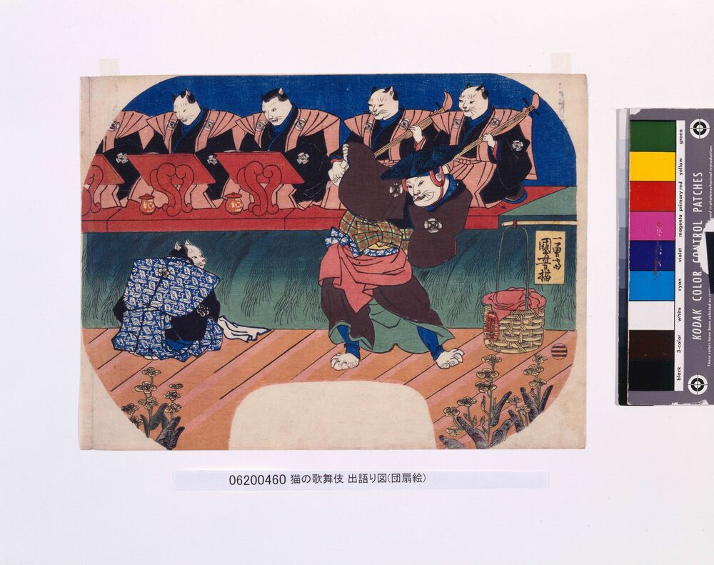 Fig. 01: Neko no kabuki degatari-zu. Utagawa Kuniyoshi, 1842. Fonte: Tokyo Museum Collection.
Nascido em 1798, Kuniyoshi foi pioneiro em colocar os animais em primeiro plano, consolidando-os como tema recorrente das peças de ukiyo-e. Antes das reformas, podemos encontrar os gatos em suas bijingas (lit. “retrato de pessoa bonita”), onde os felinos eram coadjuvantes em retratos de mulheres vestidas em estampas elaboradas; e cenas de batalha entre felinos mitológicos e soldados – dois assuntos que, além de populares, eram rentáveis e agradavam ao xogum e a elite feudal. Diante da censura do governo, o gravador realizou a partir de 1839 uma série de impressões que retratam cenas do teatro kabuki e da rotina da corte imperial protagonizadas por gatos antropomorfizados. Dessa maneira, Kuniyoshi conseguia evitar a censura imposta pelo xogunato ao mesmo tempo que mantinha sua obra rentável e palatável. Mas o interesse do artista em apresentar gatos em suas gravuras permaneceu mesmo após o fim das medidas de censura em 1845: Kuniyoshi produziu consistentemente obras que retratavam os animais engajados nas mais diferentes atividades humanas até sua morte, em 1861.
Para além de seus felinos antropomórficos e folclóricos, ao longo de sua carreira Utagawa Kuniyoshi desenvolveu séries de gravuras temáticas com gatos. Na série de sete gravuras Neko no ateji (Homófonos de gato, 1842), Kuniyoshi ilustras gatos em posições que formam caracteres do alfabeto kana, constituindo nomes de diferentes animais marinhos; no tríptico Sono mama jiguchi myō kaikō gojūsanbiki (Gatos sugeridos como as 53 estações de Tōkaidō, 1850, fig. 02), o artista representa cada shukuba da estrada de Tōkaidō como um gato diferente. Seu estudo de observação dos gatos de rua é materializado em suas brincadeiras com a anatomia dos animais e, no lugar de composições complexas, simples imagens de gatos engajados em atividades cotidianas, de maneira a enfatizar o movimento de seus corpos.
Fig. 01: Neko no kabuki degatari-zu. Utagawa Kuniyoshi, 1842. Fonte: Tokyo Museum Collection.
Nascido em 1798, Kuniyoshi foi pioneiro em colocar os animais em primeiro plano, consolidando-os como tema recorrente das peças de ukiyo-e. Antes das reformas, podemos encontrar os gatos em suas bijingas (lit. “retrato de pessoa bonita”), onde os felinos eram coadjuvantes em retratos de mulheres vestidas em estampas elaboradas; e cenas de batalha entre felinos mitológicos e soldados – dois assuntos que, além de populares, eram rentáveis e agradavam ao xogum e a elite feudal. Diante da censura do governo, o gravador realizou a partir de 1839 uma série de impressões que retratam cenas do teatro kabuki e da rotina da corte imperial protagonizadas por gatos antropomorfizados. Dessa maneira, Kuniyoshi conseguia evitar a censura imposta pelo xogunato ao mesmo tempo que mantinha sua obra rentável e palatável. Mas o interesse do artista em apresentar gatos em suas gravuras permaneceu mesmo após o fim das medidas de censura em 1845: Kuniyoshi produziu consistentemente obras que retratavam os animais engajados nas mais diferentes atividades humanas até sua morte, em 1861.
Para além de seus felinos antropomórficos e folclóricos, ao longo de sua carreira Utagawa Kuniyoshi desenvolveu séries de gravuras temáticas com gatos. Na série de sete gravuras Neko no ateji (Homófonos de gato, 1842), Kuniyoshi ilustras gatos em posições que formam caracteres do alfabeto kana, constituindo nomes de diferentes animais marinhos; no tríptico Sono mama jiguchi myō kaikō gojūsanbiki (Gatos sugeridos como as 53 estações de Tōkaidō, 1850, fig. 02), o artista representa cada shukuba da estrada de Tōkaidō como um gato diferente. Seu estudo de observação dos gatos de rua é materializado em suas brincadeiras com a anatomia dos animais e, no lugar de composições complexas, simples imagens de gatos engajados em atividades cotidianas, de maneira a enfatizar o movimento de seus corpos.
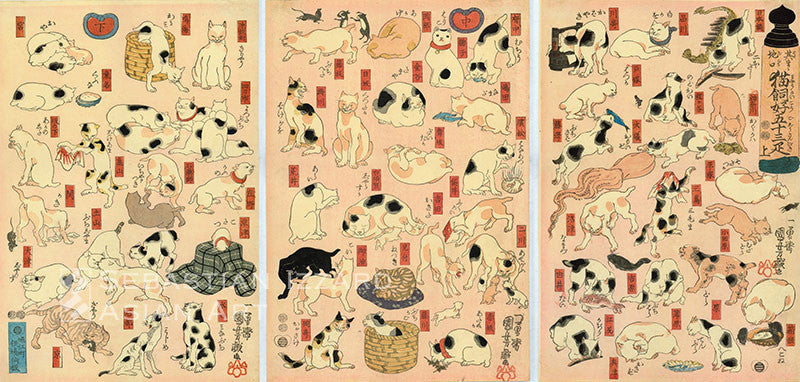 Fig. 02: Sono mama jiguchi myō kaikō gojūsanbiki. Utagawa Kuniyoshi, 1850. Fonte: Kuniyoshi Archives
(...)
Fig. 02: Sono mama jiguchi myō kaikō gojūsanbiki. Utagawa Kuniyoshi, 1850. Fonte: Kuniyoshi Archives
(...)
xxx
Dor
2023 _ Published in the book "Escritos de Artes, Escritos de Artistas vol. 3"
click to read in English
Full text is available here
Olhe para suas mãos. Mova seus dedos. Sinta cada articulação, ouça cada estalar, explore o ar com suas mãos. Lembre de cada vez que os espaços entre os dedos de suas mãos foram preenchidos por outros dedos, por fios de cabelo, pela carne macia de outro alguém.
(Hoje você sente o vazio).
Ma (間) é uma interpretação do vazio que representa um espaço vazio, um intervalo, uma matéria impalpável que existe onde a matéria física não ocupa. Jikan, junção de ma com ji (時, hora), transmite a ideia do correr de um período – o entre-tempo, o tempo como movimento: na inescapável continuidade da dimensão temporal, não existem vazios. Ma implica na existência de um intervalo, nem somente de tempo nem somente de espaço, mas que atravessa ambos de forma a torná-los indissociáveis; não é apenas o vazio que existe entre dois espaços preenchidos, mas um terceiro espaço, que carrega propósito em si. Ma não é ausência, mas presença tempo-espaço.
(Ma é a mão da saudade junto à sua).
A construção de um espaço físico se divide em três etapas. A primeira é a desordem aparente, quando intuitivamente tentamos impor a organização humana à natureza; a segunda é a ordem geométrica, quando a imposição do modelo organizacional humano é feita por meio da matemática, de forma consciente; e a terceira, a ordem sofisticada: isto é, uma ordem orgânica, natural, que torna a percepção do espaço uma experiência consciente. A sua mão junto de outra constrói uma estrutura orgânica e consciente; o entrelaçar dos dedos em um grupo de dedos alienígena ao seu corpo é uma manifestação do desejo de mesclar-se à carne alheia.
Partamos, então, do pressuposto de que cada conglomerado de matéria existente possui uma carne (chair), um campo imaterial, que a envelopa: “A carne de que falamos não é a matéria. Consiste no enovelamento do visível sobre o corpo vidente, do tangível sobre o corpo tangente. [...] A carne (a do mundo ou a minha) não é contingência, caos, mas textura que regressa a si e convém a si mesma”. O ponto/momento de encontro entre les chairs du monde é o quiasma: sem o tocante, não há o tocado; o quiasma é, em si, um universo completo de sensação encapsulado em si. O apalpador e o apalpado são obrigatoriamente distintos, entre os quais há uma área de intersecção, um momento de toque. Nesse caso, há uma relação de interior e exterior: o quiasma entre o eu (que toco) e o mundo (o que toco). Mas, ao mesmo tempo que toco, também sou tocado por este, e ele me toca em retorno; somos-no-mundo, tão separados quanto partes indissociáveis do que nos rodeia.
(Seu desejo: tão separado quanto parte indissociável de ti).
Os componentes do corpo humano - o corpo, em si, representando uma entidade separada do mundo por um delineado de ossos, nervos, veias, artérias, músculos e órgãos - são um veículo, matéria orgânica habitada pelo Eu; meu corpo simultaneamente sujeito e objeto; limiar da minha percepção, se posicionando como obstáculo de Mim. Entretanto, sem corpo físico não haveria experiência. Uma miríade de desejos pode estar por trás da experiência do toque entre epidermes: um aperto de mão firme que visa impressionar; um cafuné que demonstra afeto, platônico ou romântico; um corpo envelopado em outro corpo no momento de maior vulnerabilidade de um animal (o repouso), encontrando conforto e defesa; um tapa indecoroso em um rosto merecedor; uma mão que abre um zíper em uma tarde de domingo.
(A cor do zíper: tortura palinóptica em sua retina).
Em Fenomenologia da Percepção, Merleau-Ponty se baseia largamente em Freud para postular a sexualidade como um processo que não é meramente físico, expresso pelo corpo, mas cuja expressão em si é parte integral da ontologia do Eu. O entrelaçar não homogeneiza a experiência do sexo entre os corpos engajados: “[...] se a história sexual de um homem oferece a chave de sua vida, é porque na sexualidade do homem projeta-se sua maneira de ser a respeito do mundo, quer dizer, a respeito do tempo e a respeito dos outros homens.”
(Você lembra do último entrelaçar de sua carne na outra?)
Pode-se ruminar nesse momento como o último, mas não podemos falar de um fim definitivo: o único encerramento verdadeiro que conhecemos é a morte. Viver depende de morrer - a finalidade da existência é a sua descontinuidade. A morte é a condição básica da vida, já que é por meio dela (por processos como a decomposição) que é reposto o que é necessário para o surgimento de novos seres, incluindo o espaço físico requerido para o existir encarnado. O sexo, o erotismo, são buscas pela continuidade: uma breve fuga da inescapável cisão entre consciência e carne; até mesmo na ausência do entrelaçar, da continuidade, pode-se pontuar o desejo sexual/mórbido.
(A ausência é sua grande amiga).
(...)
xxx